POSTS
LENS FLARE, identification, Destiny 2
In Destiny 2, environmental lens flare is often tastefully and subtly applied to make stunning panoramas and scenery. Just take a look below at the Reckoning and Queen’s Court areas of the game. It’s the only first person shooter I’ve dropped everything I’m doing at times just to explore the scenery.
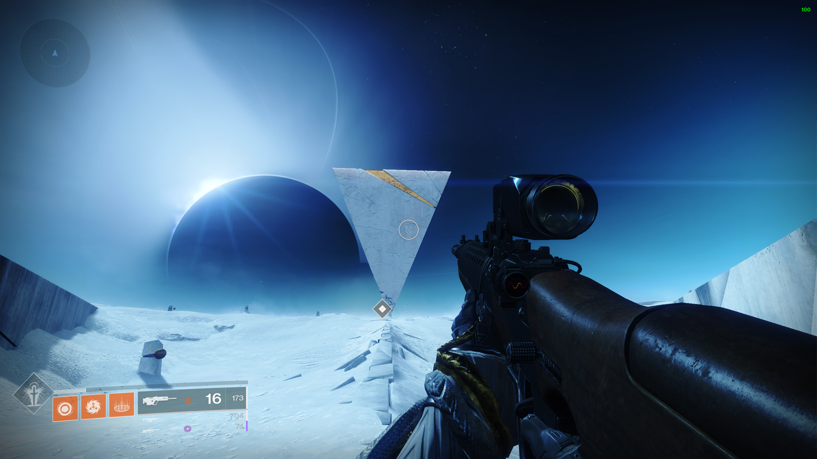
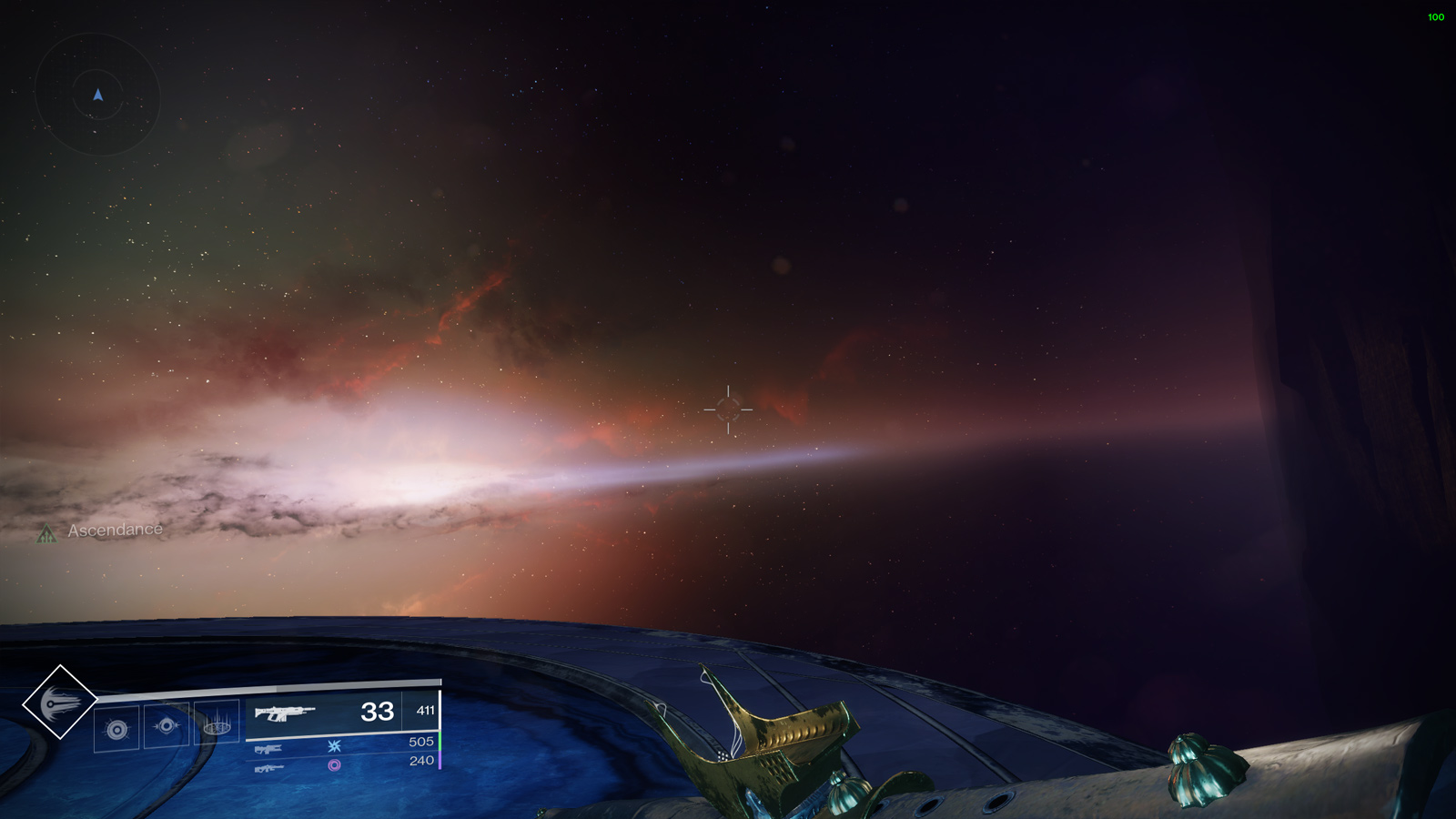
What’s even more interesting, however, is where lens flare is slathered like a J.J. Abrams movie: combat. The heavy use of anamorphic lens flare (long tail horizontal flare) and glow in combat fundamentally changes the speed of visual identification in a first person shooter.
Take a look at the screenshot below. How long does it take for you to pick out all the targets?

Even with my legally-blind-without-correction eyes, this took a fraction of a second to pick out every suspect in the lineup. I suspect it took you about as long.
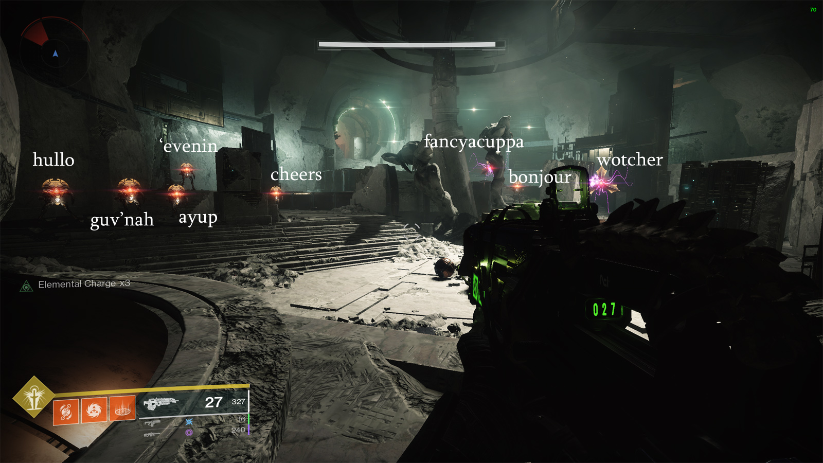
Screenshots don’t do justice to how fast target identification happens. In motion, it’s even faster.
Let’s take a look at a scene further in the instance, where the action is heavier and I’m under fire.
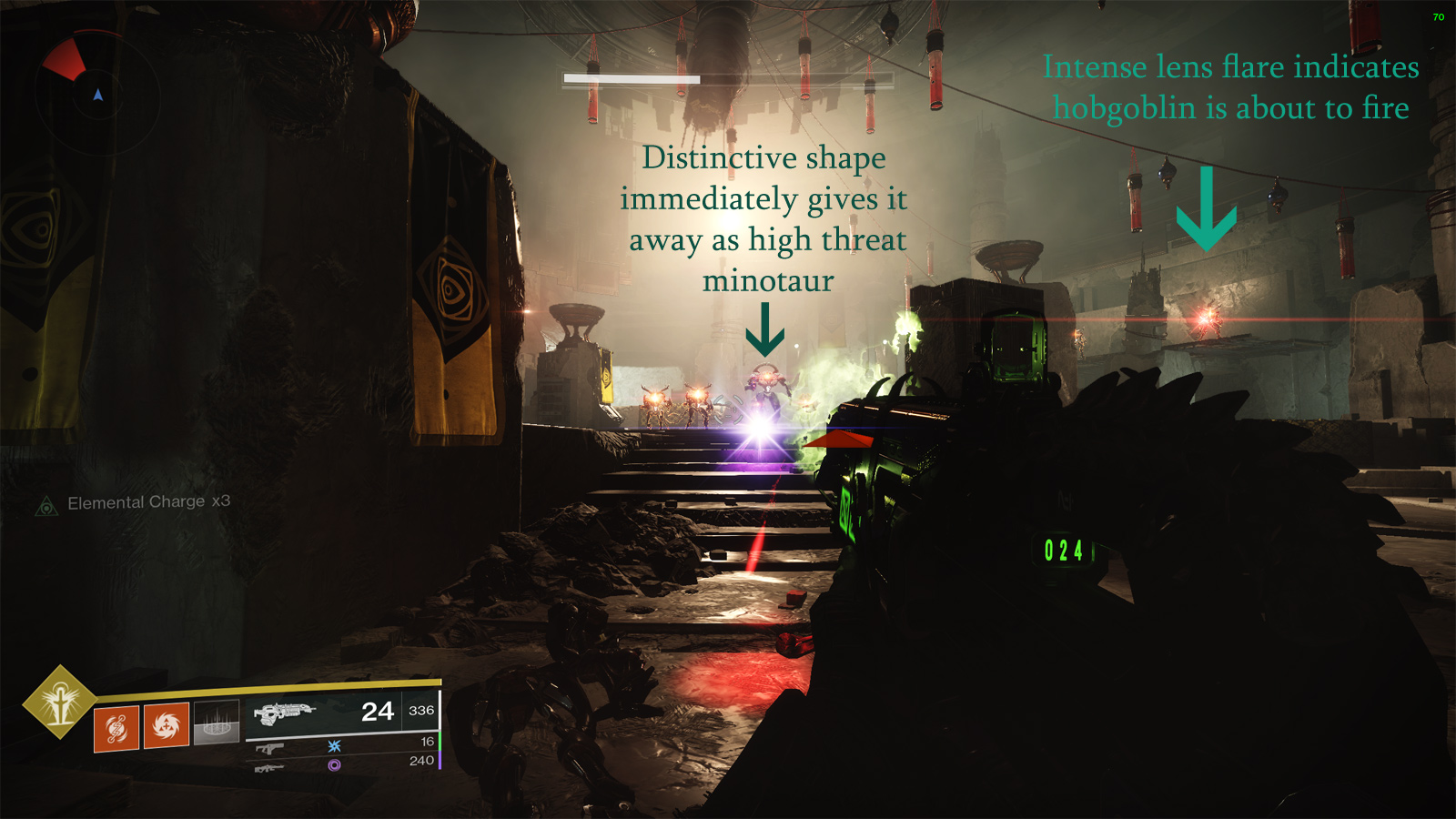
The bright lights are dead giveaways as to where the threats are. Notice to the right the very intense anamorphic lens flare - this is a consistent mechanic the game uses to signal you that you’re about to take a powerful shot or ability from that location.
Below is a screenshot of another faction of enemies, the Hive, at long distance.
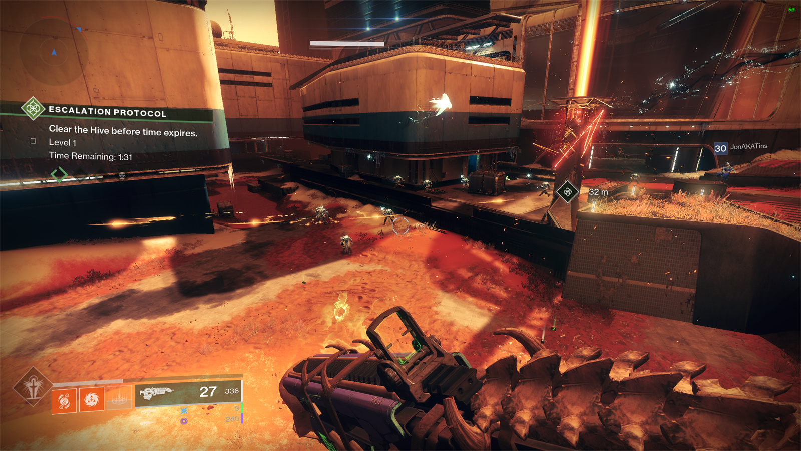
Same story. Big glowing eyeballs. Same with the Taken.
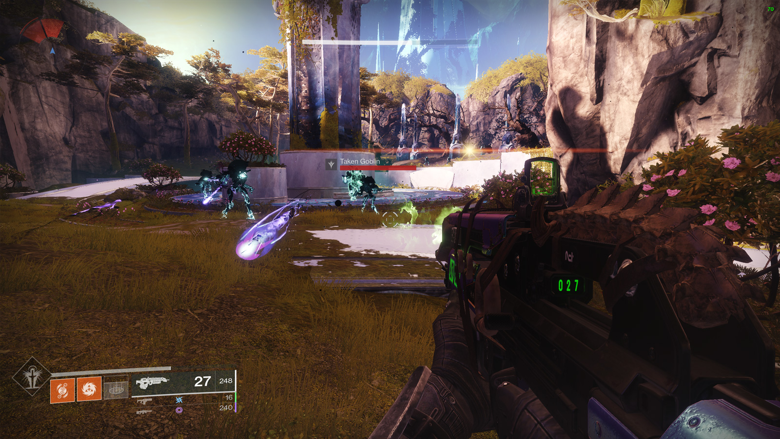
Notice the anamorphic lens flare in the center right from a Hobgoblin that’s about to fire? Below, the Fallen keep this glowing eyeball trend.
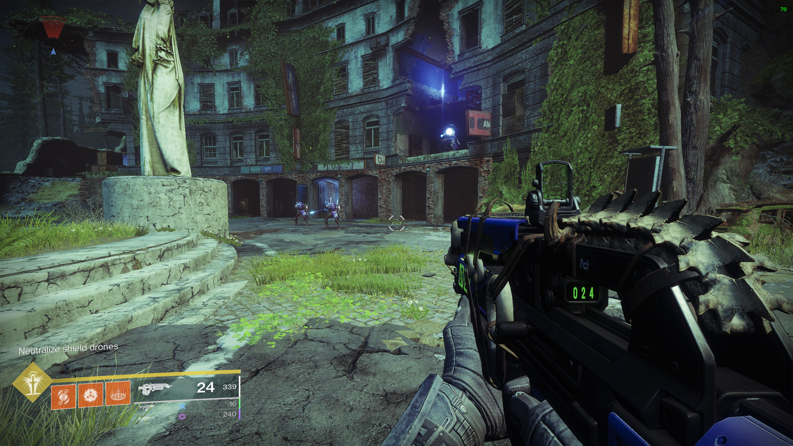
And the Cabal, while lacking the glowing eyeballs, are still apparent as a consequence of the tracers they fire and the bright red, white, and black jackets they wear.
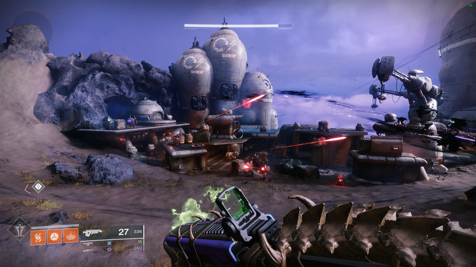
Enemies stick out like a sore thumb in Destiny 2, not just because of the glowing lights, but also because they actively eschew camouflage.

I’ve put all of the basic enemies side by side above. Notice one common thing: they all sport large patches of the same, solid color with little to break up visual continuity.
This makes no sense from a lore standpoint within the game, where supposedly some of these factions have been fighting and evolving over the course of millenia. Advanced alien armies settling on solid, bright purple, white, and red uniforms is absolutely asinine and is akin to throwing tracer dye all over the army. The Hive and Taken also have made no attempt to evolve away from entirely glowing or monocolor entities.

I want to touch on silhouetting because this is an important concept in character (and to an extent, general) design. It has a variety of concepts bundled into it, but the one I want to focus on is the speed at which individual characters can be distinguished from one another.
Creating high-contrast, blank and white silhouettes allows an artist to check how varied and identifiable their designs are, but this transfers into the more general concept of outlines when not stenciled this way. Grossly differing outlines are an immediately accessible way to allow your audience to identify different objects.
You’ll notice that animators in traditional or 3D films may create exaggerated proportions (and outlines) in order to make their characters easier to distinguish from each other at a glance. Inversely, characters with similar outlines take longer to identify, as it requires mentally processing the visual features within a core outline. Make a silhouette of Nickelback, and it could take a while to figure out who’s who.

How does lens flare and silhouetting come together to make identification instantaneous? Below, I’ve created silhouettes for every moving Vex enemy in the lineup, from the lowly Goblin all the way up to the Hydra. Notice how they’re already all uniquely identifiable from a glance.

Now take a look at where the lens flare appears in each one.

That’s right. The position alone of the lens flare, relative to center of mass, is enough to tell you what opponent you’re staring down. Add in the fact that enemies are painted in high-contrast single colors, making finding center of mass easy, and it makes target identification in Destiny 2 the easiest it’s ever been in a first person game. These are fantastic visual decisions to make gunplay engaging: the player is focusing on what resources to commit rather than spending time searching for and identifying targets.
These might be obvious lessons, and we see the same, or similar, techniques in many first person games. That being said, it’s far from universal. Take a look at these screenshots from a different space shooting looter game, a game that tries to make a sensical sci-fi combat framework where enemies use camouflage and try not to give their position away.
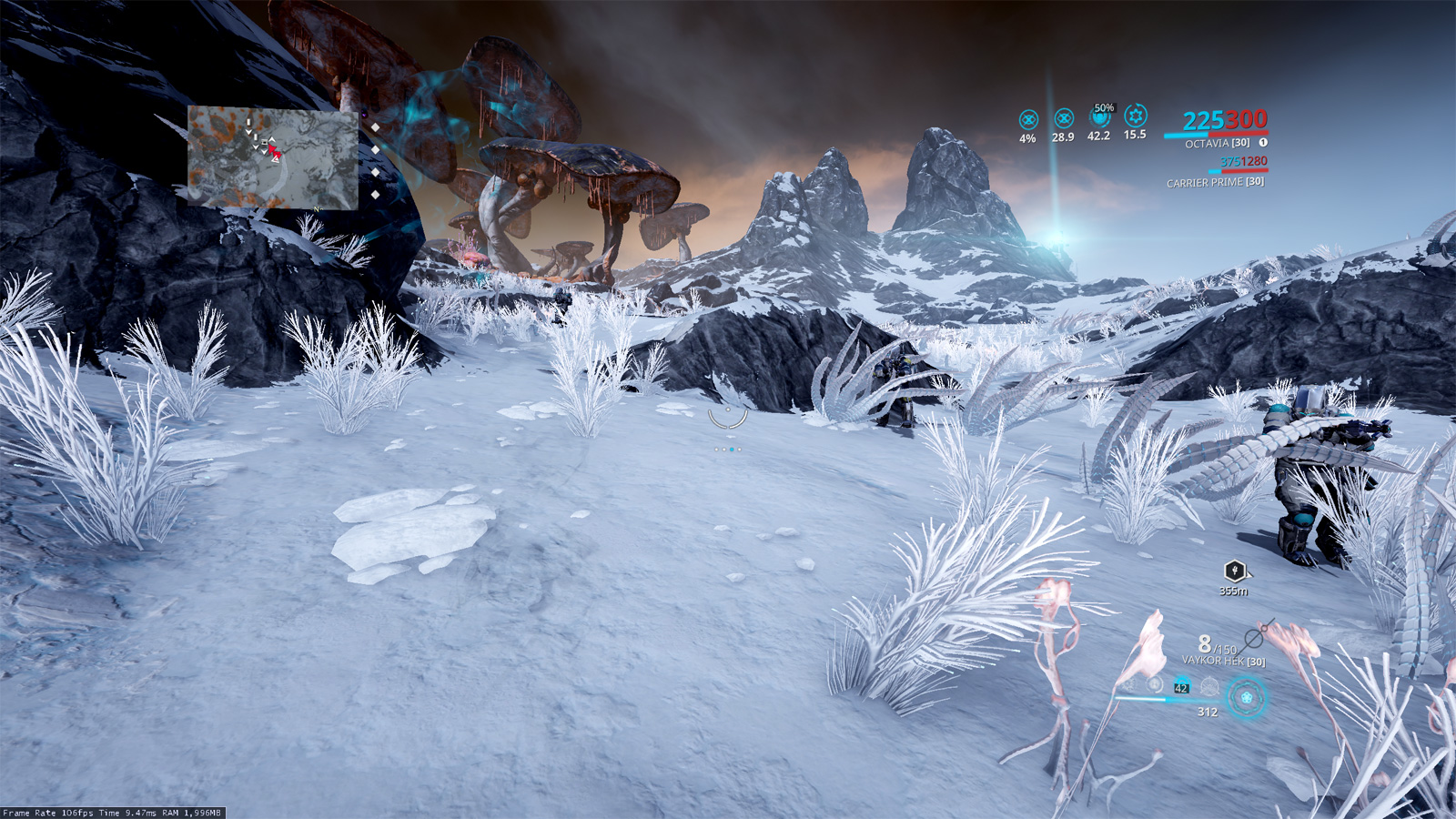
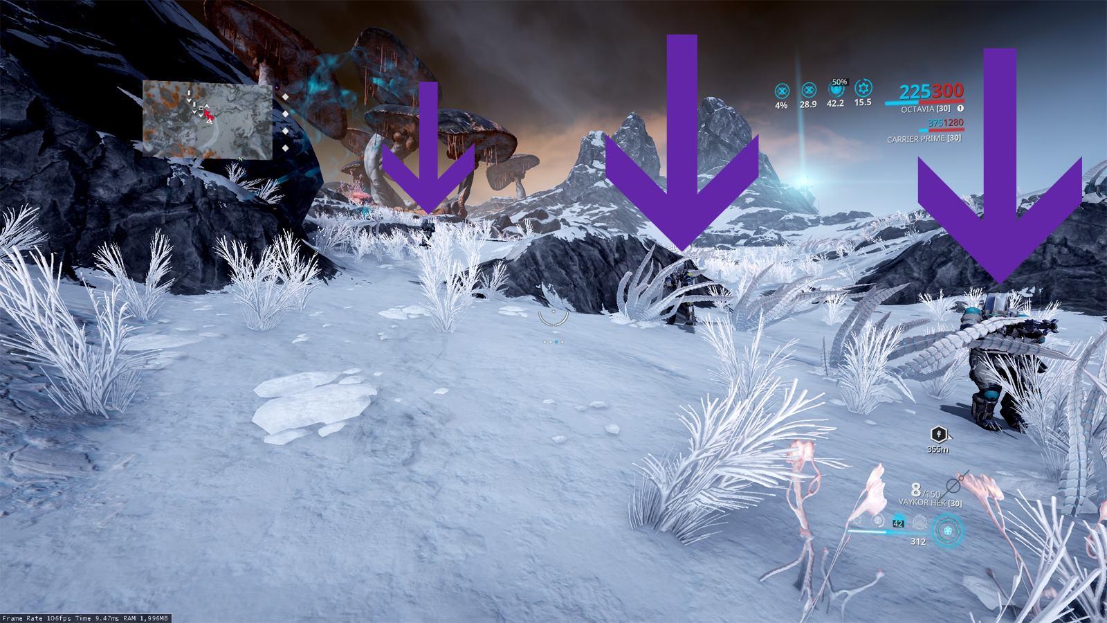
Did you see the three Crewman aiming weapons? Here, let me point them out.
Or let’s play “Where’s Waldo” with Grineer in an Earth forest.
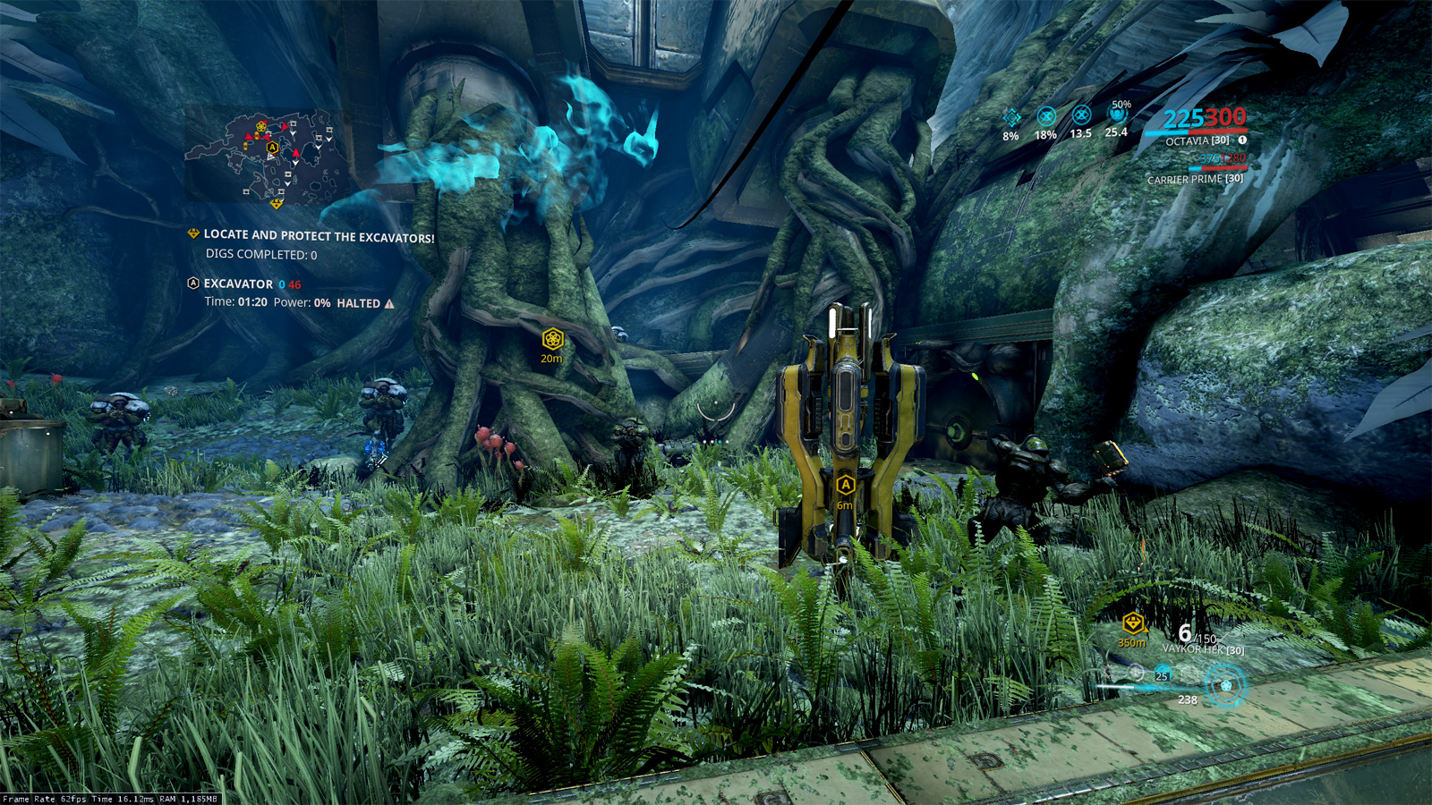
Find everyone? How long did it take?

Don’t get me wrong, Warframe is a great game that does a lot of things right, but I could tell that Bungie spent a lot of time collaborating about what makes for satisfying gunplay in Destiny 2.
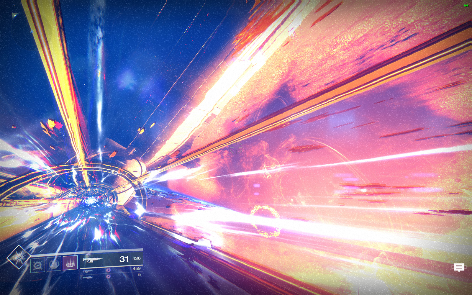
And it’s got some pretty amazing views, too.